> ## Documentation Index
> Fetch the complete documentation index at: https://docs.tessact.ai/llms.txt
> Use this file to discover all available pages before exploring further.
# Text inspector
> Create a precise typographic layer with transform, content, appearance, and animation.
Text is an editable visual layer rather than baked media. Its content, font metrics, wrapping, box geometry, and appearance are all saved with the composition.
 ## Transform
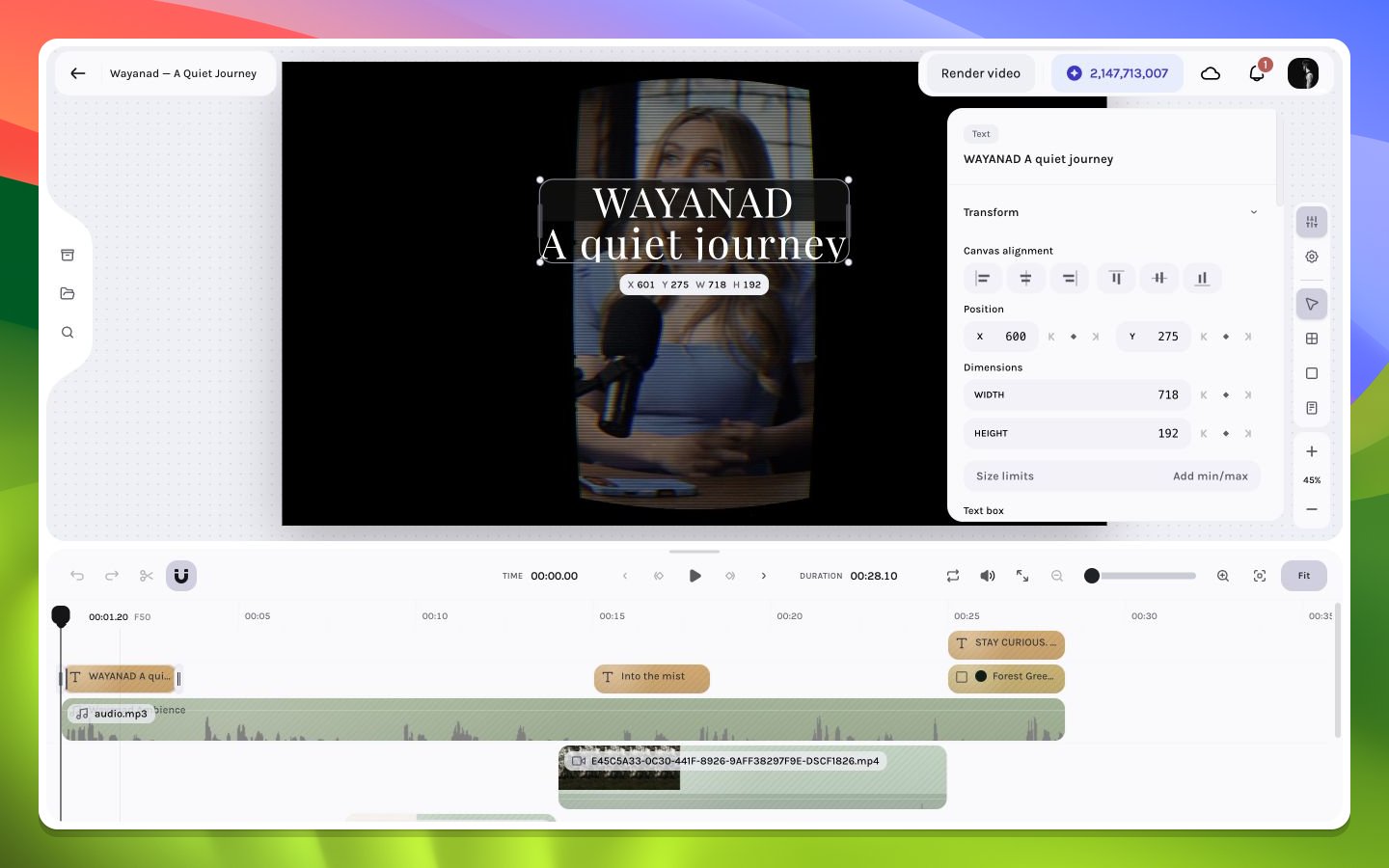
Position, dimensions, rotation, scale, alignment, and aspect behavior define the text box in the composition or parent space. Box width directly affects wrapping.
## Typography
The inspector exposes font family and style, font size, line height, letter spacing, text value, horizontal alignment, writing direction, and text transform. Use line height and tracking as ratios to the chosen size rather than copying arbitrary values between unrelated fonts.
The text-value field previews each change immediately and groups continuous typing into one practical undo step. Move focus away when you finish editing. **Escape** does not revert the text; use Undo after the edit commits when you need the previous value.
## Appearance
Opacity and blend mode combine the text with the scene. Fill color accepts a solid or two-stop linear gradient; stroke color remains solid-only. An optional text background can add its own solid or gradient color, radius, and horizontal padding. Effects and multiple shadows can add hierarchy, but they should reinforce legibility rather than replace a sound type scale.
## Transform
Position, dimensions, rotation, scale, alignment, and aspect behavior define the text box in the composition or parent space. Box width directly affects wrapping.
## Typography
The inspector exposes font family and style, font size, line height, letter spacing, text value, horizontal alignment, writing direction, and text transform. Use line height and tracking as ratios to the chosen size rather than copying arbitrary values between unrelated fonts.
The text-value field previews each change immediately and groups continuous typing into one practical undo step. Move focus away when you finish editing. **Escape** does not revert the text; use Undo after the edit commits when you need the previous value.
## Appearance
Opacity and blend mode combine the text with the scene. Fill color accepts a solid or two-stop linear gradient; stroke color remains solid-only. An optional text background can add its own solid or gradient color, radius, and horizontal padding. Effects and multiple shadows can add hierarchy, but they should reinforce legibility rather than replace a sound type scale.
 ## Text box sizing
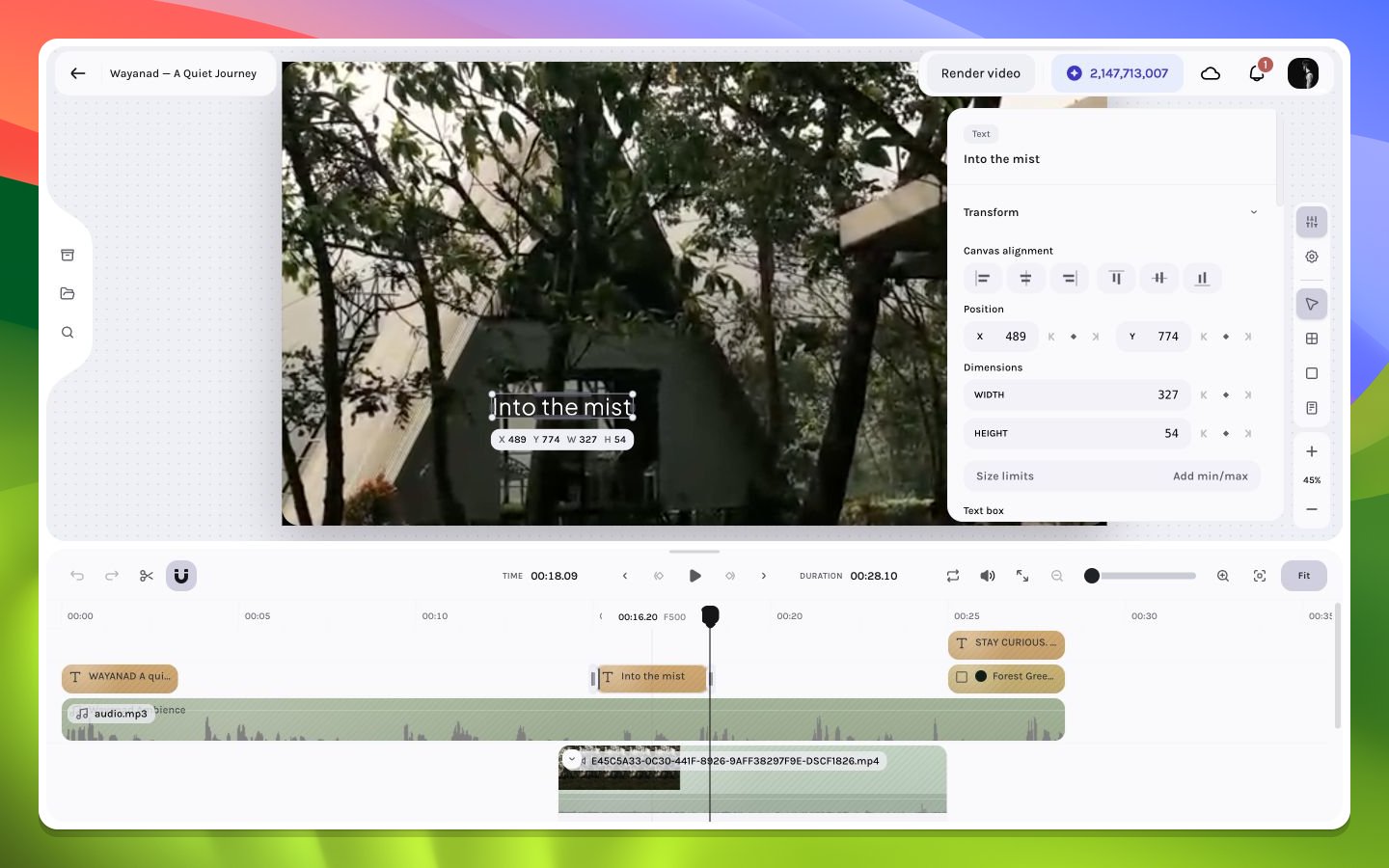
The **Text box** controls sit inside **Dimensions** and determine how authored width and height interact with content:
| Control | Options | Behavior |
| ------- | ------------------------------------------- | ---------------------------------------------------------------------------------------- |
| Width | **Fixed**, **Hug** | Fixed keeps the authored width; Hug relayouts width around content |
| Height | **Fixed**, **Hug** | Fixed keeps the authored height; Hug relayouts height around content |
| Flow | **Wrap**, **Overflow**, **Cut off** | Wrap makes lines; Overflow permits text beyond a constrained box; Cut off clips overflow |
| Fit | **None**, **Scale down**, **Scale up/down** | Adjusts glyph scale inside a fully constrained box |
**Fit** is enabled only when both effective axes are constrained. Choosing **Hug** on either axis resets Fit to **None** and enables resize-on-edit behavior. When a parent frame's managed layout owns an axis, the inspector shows a read-only **Fill** value for that axis; change the parent layout or child sizing rule instead of trying to override it from the text layer.
## Inline text background
Choose **Add background** in Appearance to create a background attached to the text layout. Once present, the inspector exposes:
* a solid or two-stop linear-gradient color;
* background border radius;
* horizontal padding from `0` to `100` composition pixels;
* **Remove background**, which removes the background styling without deleting the text.
Background padding participates in text relayout. Review wrapping and box size after changing it, especially with a Hug axis or parent-managed Fill.
## Crop
Text layout occurs inside the box before crop and compositing. A narrow box can create extra lines; a crop can then hide glyphs without changing the text value. Diagnose clipping by checking box dimensions, line height, and crop in that order.
## Animation
Position, dimensions, scale, rotation, opacity, and supported visual finish parameters can be keyframed. Font changes are better treated as discrete design decisions unless the current control explicitly exposes animation.
For a title, establish readable static typography first, then animate only position and opacity. Motion should preserve the line break at every frame.
See [colors and gradients](/editor/effects/colors-gradients), [caption typography](/editor/captions/style), [shadows](/editor/effects/shadows), and [keyframes](/editor/animation/add-keyframes).
## Text box sizing
The **Text box** controls sit inside **Dimensions** and determine how authored width and height interact with content:
| Control | Options | Behavior |
| ------- | ------------------------------------------- | ---------------------------------------------------------------------------------------- |
| Width | **Fixed**, **Hug** | Fixed keeps the authored width; Hug relayouts width around content |
| Height | **Fixed**, **Hug** | Fixed keeps the authored height; Hug relayouts height around content |
| Flow | **Wrap**, **Overflow**, **Cut off** | Wrap makes lines; Overflow permits text beyond a constrained box; Cut off clips overflow |
| Fit | **None**, **Scale down**, **Scale up/down** | Adjusts glyph scale inside a fully constrained box |
**Fit** is enabled only when both effective axes are constrained. Choosing **Hug** on either axis resets Fit to **None** and enables resize-on-edit behavior. When a parent frame's managed layout owns an axis, the inspector shows a read-only **Fill** value for that axis; change the parent layout or child sizing rule instead of trying to override it from the text layer.
## Inline text background
Choose **Add background** in Appearance to create a background attached to the text layout. Once present, the inspector exposes:
* a solid or two-stop linear-gradient color;
* background border radius;
* horizontal padding from `0` to `100` composition pixels;
* **Remove background**, which removes the background styling without deleting the text.
Background padding participates in text relayout. Review wrapping and box size after changing it, especially with a Hug axis or parent-managed Fill.
## Crop
Text layout occurs inside the box before crop and compositing. A narrow box can create extra lines; a crop can then hide glyphs without changing the text value. Diagnose clipping by checking box dimensions, line height, and crop in that order.
## Animation
Position, dimensions, scale, rotation, opacity, and supported visual finish parameters can be keyframed. Font changes are better treated as discrete design decisions unless the current control explicitly exposes animation.
For a title, establish readable static typography first, then animate only position and opacity. Motion should preserve the line break at every frame.
See [colors and gradients](/editor/effects/colors-gradients), [caption typography](/editor/captions/style), [shadows](/editor/effects/shadows), and [keyframes](/editor/animation/add-keyframes).